Marketing & Colours – the duo you might have skipped
- October 3, 2020
")
Are you thinking about making a website for your business or changing the current one? Do you know the importance that colours have while persuading your customers? The entire cycle of persuasion starts with a specific colour. Colours simply define the mood and influence your responses.
Have you ever realised how colours play a role in influencing individuals’ perception and behaviour? Do you what is the role of colour in branding? Do you ever wonder why each brand has a different colour from the entire palate, completely belonging to the brand – say, Red for Coco-Cola or Black for Nike?
Here’s the test – People who love the colour orange are generally cheerful, friendly and confident. You would find them in parties, sipping Harvey Wallbanger. They would love to be around kids and… but what has marketing to do with it? Why is necessary to focus on selecting the right colours for your brand?
Well, for starters, it helps you select and design your brand logo. Keeping your target audience’s likes and patterns in the centre while designing your logo, nobody can dare to overlook your brand!
Let us start with some basics…
WHAT IS PSYCHOLOGY OF COLOUR?
Psychology of Color lets you predict the responsive pattern to your marketing efforts based on the colour that you have used to appeal to the audience.

If you pick the right palate to enhance the value of your site and your product, your target will have absolutely no rejection for purchase!
You can refer to Asprey to refer to the luxurious feeling that its purple vibes bring us to. Check the high-end accessories, jewellery and other luxurious items and see the luxurious vibes that purple brings in.
WHY IS COLOUR IMPORTANT TO YOUR BRAND?
- Improves brand recognition and consumer’s trust.
- Helps to connect your audience with your brand…
- Pushes the audience to complete their actions.
- Makes you stand out from the competition.
- Transcend the traditional looks and bring in growth for your business.
Hence, if you are planning to improve your conversion rate, every element of your landing page should work as per the directions of the Psychology of Colour.
HOW TO SELECT THE RIGHT PALATE FOR YOUR HOMEPAGE ELEMENTS?
The purchasing decision of 85% of the shoppers is based on colours. You cannot miss the chance of ignoring this point. Are you thinking about where, to begin with?
BEGIN WITH YOUR AUDIENCE
Think about the following questions:
- Who is your target audience?
- What are their preferences?
- What about their ethnicities?

Just as you saw above, each colour represents a different type of personality. That is not the end, you also need to keep the age, gender and culture in mind. Why?
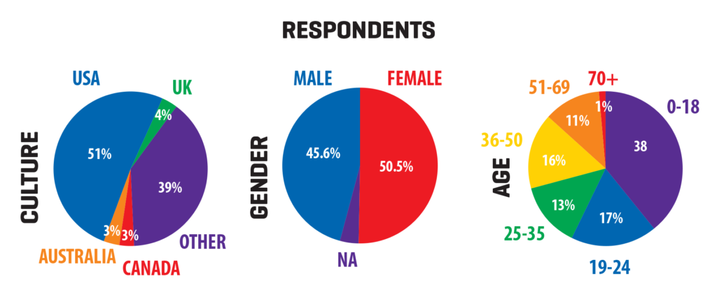
Keep up with the above-mentioned factors and select your preference keeping these factors in mind!
ADD ACCENT COLOURS TO ENHANCE YOUR IMPACT
The second most information is conveyed through the accent colours. Have a look at this.

Doing so will help to increase web conversions and will keep the audience engaged through the entire sales funnel. You need to provide them with obvious actions that you wish them to take, and hence we emphasise upon accent colours.
USE THESE TOOLS TO GET A GREEN-LIGHT
A colour wheel is your only saviour here! Choosing between Analogous Colours i.e. colours that are next to each other on the colour wheel or Complementary Colours i.e colours that are opposite to each other is the real deal. That’s why we have tools to select the right colour!

With the help of these tools, you can modify your existing colour palette or create your own. These tools help you to enhance your colour scheme and help you create a better impact.
Using a tool can help you can help you in following ways
- Remain consistent with the standard colour contrast.
- Improve the website readability.
- Improve the accessibility.
Using a tool can be a quick test to check the colour combinations that you are trying to use. This will save you a lot of time and enhance your idea or at least give a vision to the fantasy that you have created!
LET THIS PALATE BE YOUR IDENTITY
What we would suggest is to try out different colour schemes before you pick the right one.
We have seen that an individual’s perception towards a brand can be influenced using the psychology of colour. We just have to grab this chance!
The Isolation Effect that makes us remember the one that is different than the rest is more likely to be the hot potato here. The right blend of colours is necessary not just for a mere impression but it represents you. Your identity. Your values. So go for the colours that represent these in a bright manner.
REFERENCE IS A MUST
Looking out to your competitors’ schemes is necessary. It is mandatory to refer to at least 5 websites before you conclude yours. Why?
Because you don’t want to repeat the same mistakes.
Also, referring to them will give you a direct idea of your do’s and don’ts. It gives you an idea if you want to be part of the herd or you want to act all different. If you want to stand out from the rest, you will have an idea which colours to skip and if you want to play safe then you know the trick!
Are you looking for some tools? Have a look at this – https://bit.ly/3cVuXkc
SUMMARY
In order to bring more conversions to your page or make your product appealing, you need to consider the psychology of colour. 1into2 advises you to consider the colour scheme before you pick the right one because colours influence the buyer’s decisions! So consider all the above-mentioned factors before choosing the right colour!
More from our blog
See all posts


